Designing a better Kindle library experience
Kindle changed how people read over ten years, but as digital libraries grew to hundreds of books, managing them became frustrating. By understanding how readers organize their books, from marking finished books to grouping similar titles, I designed an intuitive experience that feels as natural as arranging books on a shelf. This let readers focus on what matters, their next great read.
Role
Lead designer and researcher for Kindle library experience
Amazon, 2018-2019
Amazon, 2018-2019
Impact
Redesigned Kindle’s library experience for millions, resolving key pain points and driving the iOS app rating to 5 stars.
Understanding our Readers
To understand our readers, I started a weekly newsletter I called 'the groove'. Like a vinyl record groove that deepens with every play, this newsletter helped our global team dive deeper into reader behavior. It reached 200+ members across design, product, engineering, and QA in the US, UK, and India, keeping customers front and center as we improved Kindle. Through this newsletter, we heard directly from our readers:
"I can't remember what I've read or not read so I end up opening the same books over and over."
"Other than putting books in collections, there isn't anyway to denote read, need to read, liked, don't like, read again, watch for next book in series..."
"With hundreds of titles in my library... it would be really useful if the Kindle app allowed me to view only books where the location marker is at the start of the book."
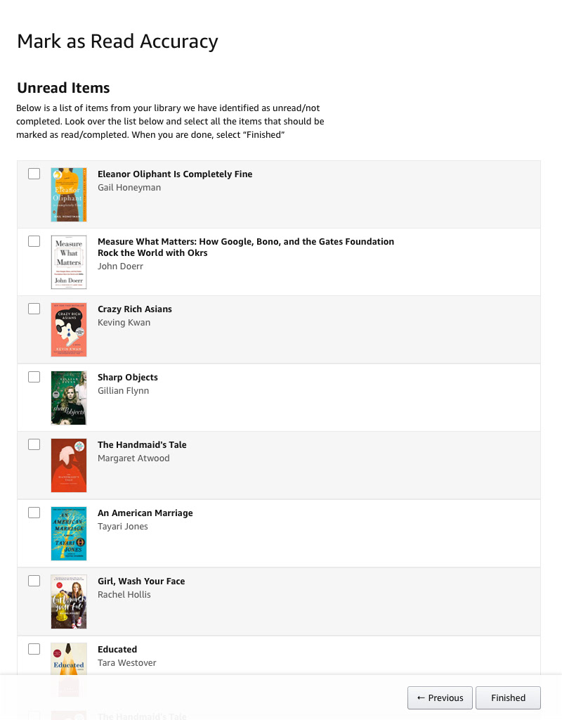
The complexity of 'finished'
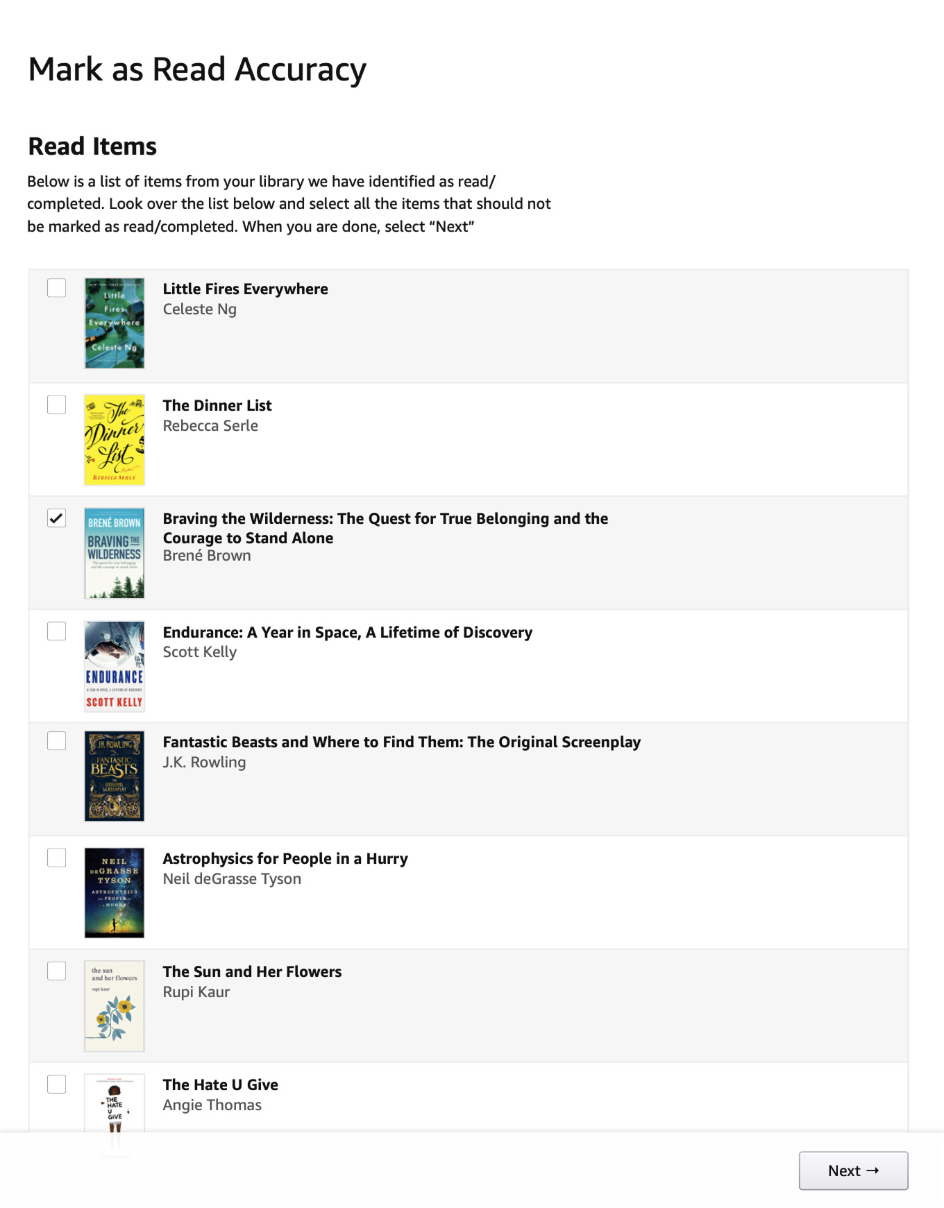
With libraries often holding hundreds of books, we couldn't turn an exciting feature into extra work by asking readers to mark their books as read manually. But detecting when a book was truly finished was tricky. Books aren't uniform- they include acknowledgments, notes, indexes, and previews, making it hard to pinpoint the real end. Getting this wrong risked breaking readers' trust.
We developed an algorithm to automatically identify finished books, testing it through reader surveys and refining based on their feedback. We erred on the side of caution, preferring to leave a book unread rather than mark it incorrectly.
Once confident in the algorithm, I invited readers to test the feature with their own libraries. I observed how they responded, learning how they felt when the algorithm got it wrong, and watched as they marked books read or unread, managed multiple titles at once, and organized their collections.
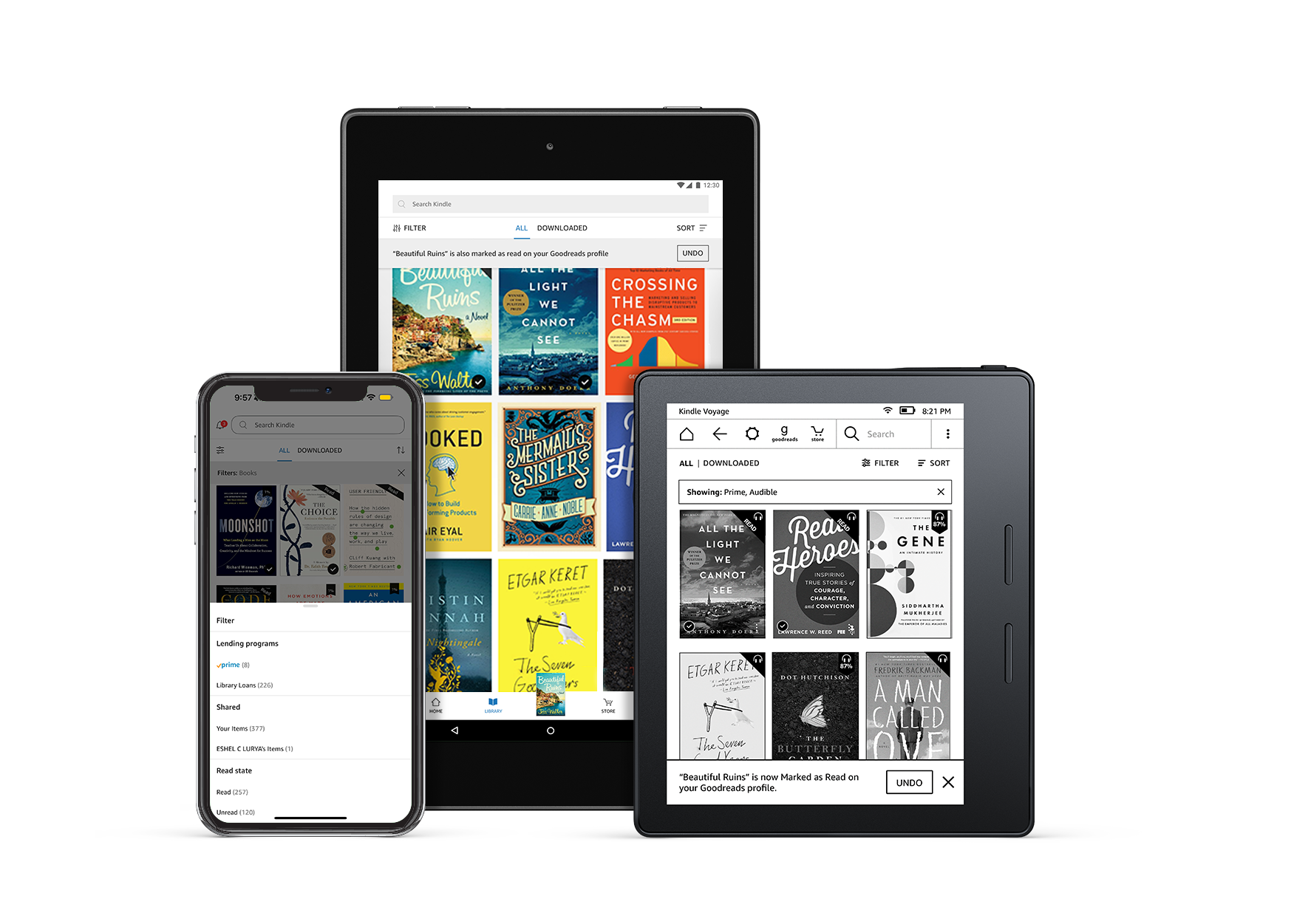
Creating a unified library experience
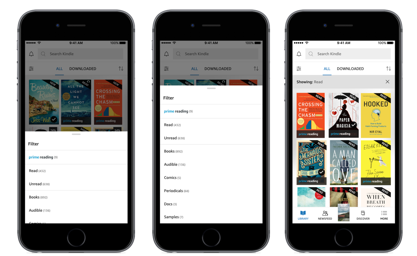
As the design lead of the library experience across all Kindle platforms (iOS, Android, Fire tablets, and E-readers) I designed an adaptive, personalized system that put readers in control. New badges clearly identified books from Prime Reading, Kindle Unlimited, and those marked as read.
Filters adjusted dynamically based on each reader's library, hiding irrelevant options. Combined filters helped readers quickly find exactly what they wanted. I designed the filter system to scale, ready to support future options like genres and languages. A persistent filter bar keeps the filter context visible, even after hours of reading.
I also introduced Kindle's first cross-platform toast notification pattern. When readers finish a book, a toast confirms it's marked as read and synced with Goodreads, with an option to undo. Borrowed Kindle Unlimited and Prime Reading books can now be returned directly from the app, with clear confirmation that notes and highlights are saved. Whether acting from home, the library, or search results, readers receive confident, immediate feedback.
Strategic Leadership
Presenting to Kindle's VP and leadership team, I partnered with Product Management to make the case for a synchronized launch across all platforms. It added complexity, but a fragmented rollout would break the experience, especially for readers who switch between devices.
I worked closely with 4 PMs/TPMs, 3 development teams (50+ engineers), and leads from Kindle Unlimited, Prime Reading, and Goodreads. Through daily standups, play-with sessions, and bug bashes, I made sure the experience felt seamless across iOS, Android, Fire tablets, and E-readers.
Rather than wait for every feature to be ready, we launched the foundation early—starting with the new filter menu—and rolled out additional options and actions over time.
The impact of thoughtful design
Launching these features across Kindle's platforms transformed library management for millions. Adaptive filters, badges, and confirmations addressed long-standing frustrations seen in app store reviews. As a result, Kindle's iOS rating climbed to 5 stars.
Readers embraced the improvements:
"I LOVE the new update that shows books you have read and unread. This was a terrific feature to add. My books go back 6 years. With a large library of 668 books since 2013... This makes it so easy to find them now."
"I'm so glad you listened to me and enabled borrow returns within the Kindle app"
"I've been using this app for years now and my only issue with it is that it has no way to separate the books, from samples, from kindle or prime books. Really really annoying that this basic feature was missing. But they just added it and that prompted me to finally review the app. Thank you to whoever made this happen."
These improvements shifted the focus back to what matters, helping readers find their next book.