
Kindle In-Book Search
For hundreds of years, readers have used books to learn more about the world, inspire creativity, and foster personal growth: with enhanced search it's even easier for readers to find and leverage the knowledge in their eBooks.
Enhanced search focused on readers that are moderately invested in developing a new skill, learning more about an existing hobby or improving themselves personally. Some of the key reading behaviors of this type of reader are annotating (mostly highlighting, note taking for more committed readers), searching for related concepts, navigating to specific pages/chapters, referencing parts of the book that matter, revisiting annotations.
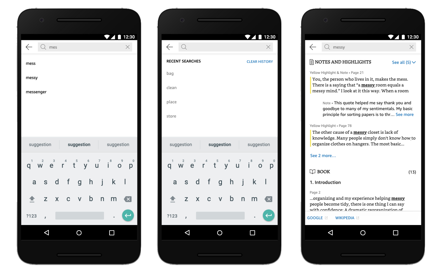
I led a design sprint together with the project manager, in which with engineers, project managers and designers we identified key opportunities and improvements. Following the design sprint, I began with the basics, re-organizing the top tool bar to give search a more prominent entry point and make it easy to search for a word from the quick actions menu so you wouldn't need to type it. Adding auto complete for search terms, pulling in from the book text itself, as well as a search history making it easy to re-search for terms quickly. Improving the search results themselves, adding chapters making it easier to skim through the results list and the ability to search through notes and highlights readers made in their books. While addressing all these I also took the opportunity to give search a visual refresh better aligning it with the newer Kindle style guide.
This was a great start but we wanted to do more. We wanted to let readers flip through the individual pages where search results appear one-by-one to get additional context about a result. Or easily jump between an explanation they searched for on one page, and the page they were reading, making it easy to compare and reference information in the book. We connected search results to Page Flip, leveraging the familiar navigation tools we had in the app instead of introducing new ones.
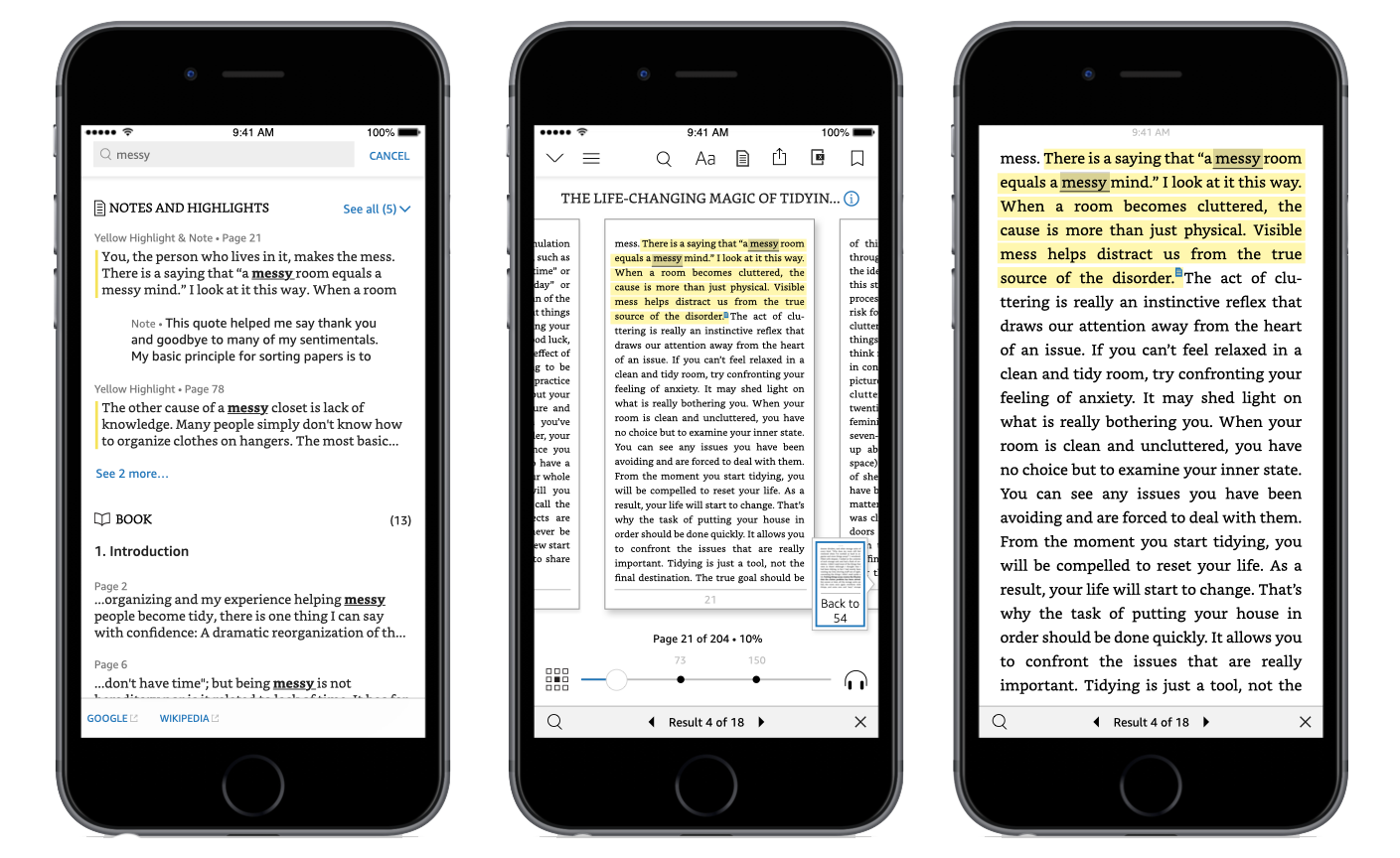
I worked on the detailed flows and designs, presented them to executives and senior stakeholders gaining buy-in. I built a prototype using Flinto and worked with a research intern to run usability studies, helping us get feedback and make decisions on areas we were less sure about (e.g the actions needed for the iterator in full page view). I fine tuned the designs and details across the Kindle iOS and android apps as well as Kindle e-reader and Amazon Fire devices, including design specs for the engineering team and worked with them to build the changes.
You can see all these live across the Kindle app on iOS and Android or any Kindle e-reader or Amazon Fire tablet.