Care Coordination at Amazon Health
I led design strategy for Amazon Health's first cross-service care coordination platform, presenting to SVP and VP leadership across three organizations and establishing thousands of relationships in 4.5 months, 40% faster than projected.
Role
Lead Sr. UX designer and researcher
Amazon, June 2024 - May 2025
Amazon, June 2024 - May 2025
Impact
Thousands of relationships established in 4.5 months, hitting targets 40% faster than projected.
• 70% conversion rate (industry-leading)
• 42% new customers acquired (care receivers)
• 30% of helpers actively placing orders
• 42% new customers acquired (care receivers)
• 30% of helpers actively placing orders
The Problem
Every day, millions of Americans help take care of someone they love. Yet today's healthcare systems often make this unnecessarily complex.
Ana wants her son Diego to help manage her medications. In traditional healthcare, this involves paperwork, phone calls, and delays, and repeating the process for every provider. Frustrated, some people give up and just share passwords, creating security risks.
The Strategic Context
Amazon was deprecating PillPack (15% of customers relied on caregiver functionality), but the vision was bigger: build care coordination infrastructure that works across all Amazon Health services, with Pharmacy as the first launch.
My role: Design for day-one scalability using language and components that work across services, not just Pharmacy.
Cross-organizational leadership: This project required navigating three distinct Amazon organizations, Health Services, Pharmacy, and Identity Services, each with different priorities and constraints. Working with engineering teams from all three organizations and Legal, HealthSec, and Privacy, I established secure, scalable infrastructure that enabled the permission framework to be reused across health, validating the platform thinking from day one.
Research: Understanding the Landscape
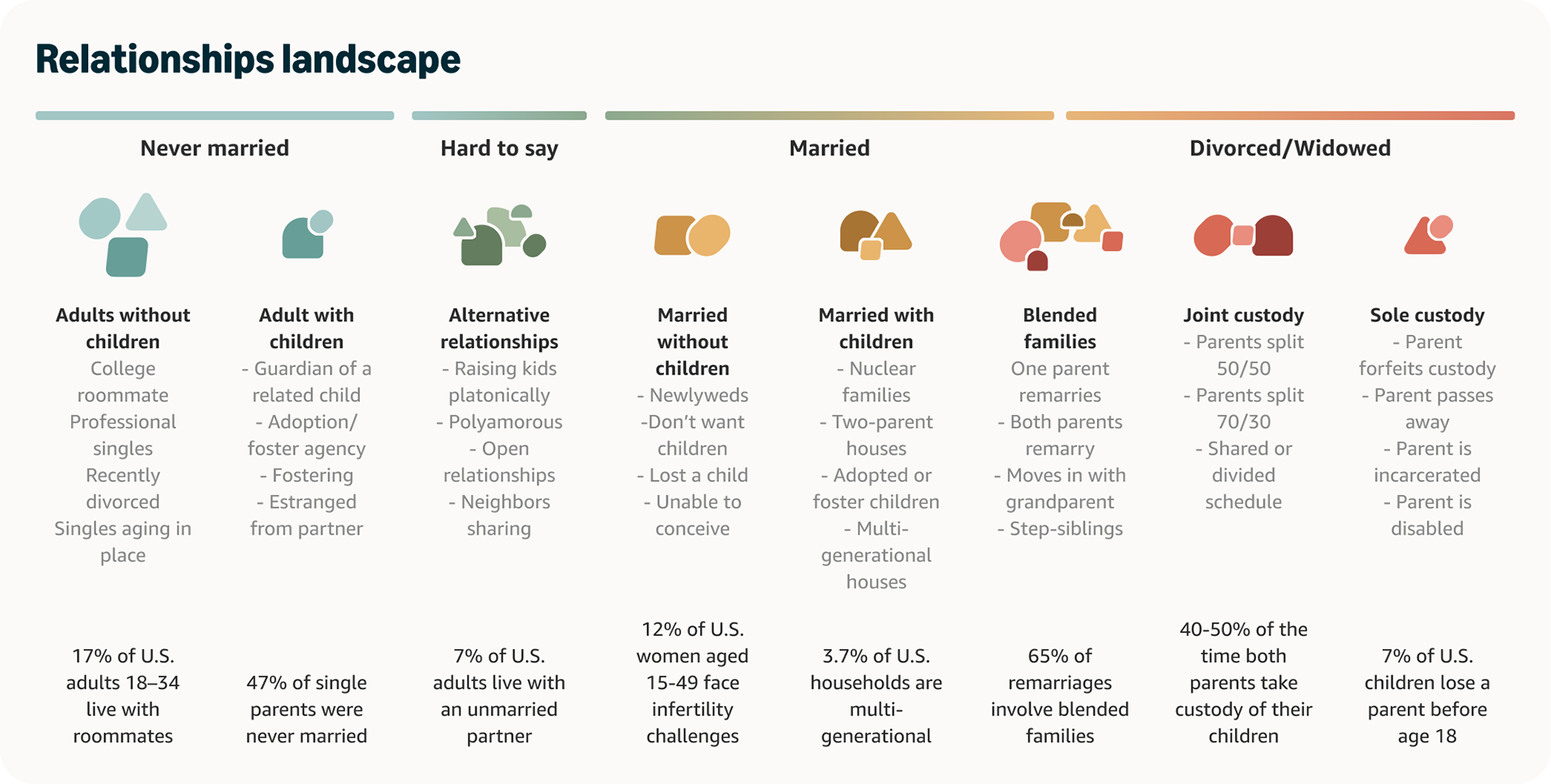
Looking at Amazon's own data, I saw that relationships shifted and evolved based on people's needs, availability, and living situations, patterns overlooked by traditional healthcare systems. Spouses took turns supporting each other, adult children coordinated care from across the country, neighbors stepped in for prescription pickups. But healthcare systems only recognized "caregiver", a clinical identity that assumed adult children caring for elderly parents.
I conducted foundational research to validate these observations
Relationships Landscape Study
65% of remarriages involve blended families
47% of single parents were never married
7% of adults live with unmarried partners
3.7% of households are multi-generational
47% of single parents were never married
7% of adults live with unmarried partners
3.7% of households are multi-generational
Language Landscape Analysis
AI analysis of 50 healthcare apps revealed an industry-wide shift from clinical terminology ("caregiver," "patient") to collaborative language ("care partner," "trusted helper," "care team member").
AI analysis of 50 healthcare apps revealed an industry-wide shift from clinical terminology ("caregiver," "patient") to collaborative language ("care partner," "trusted helper," "care team member").
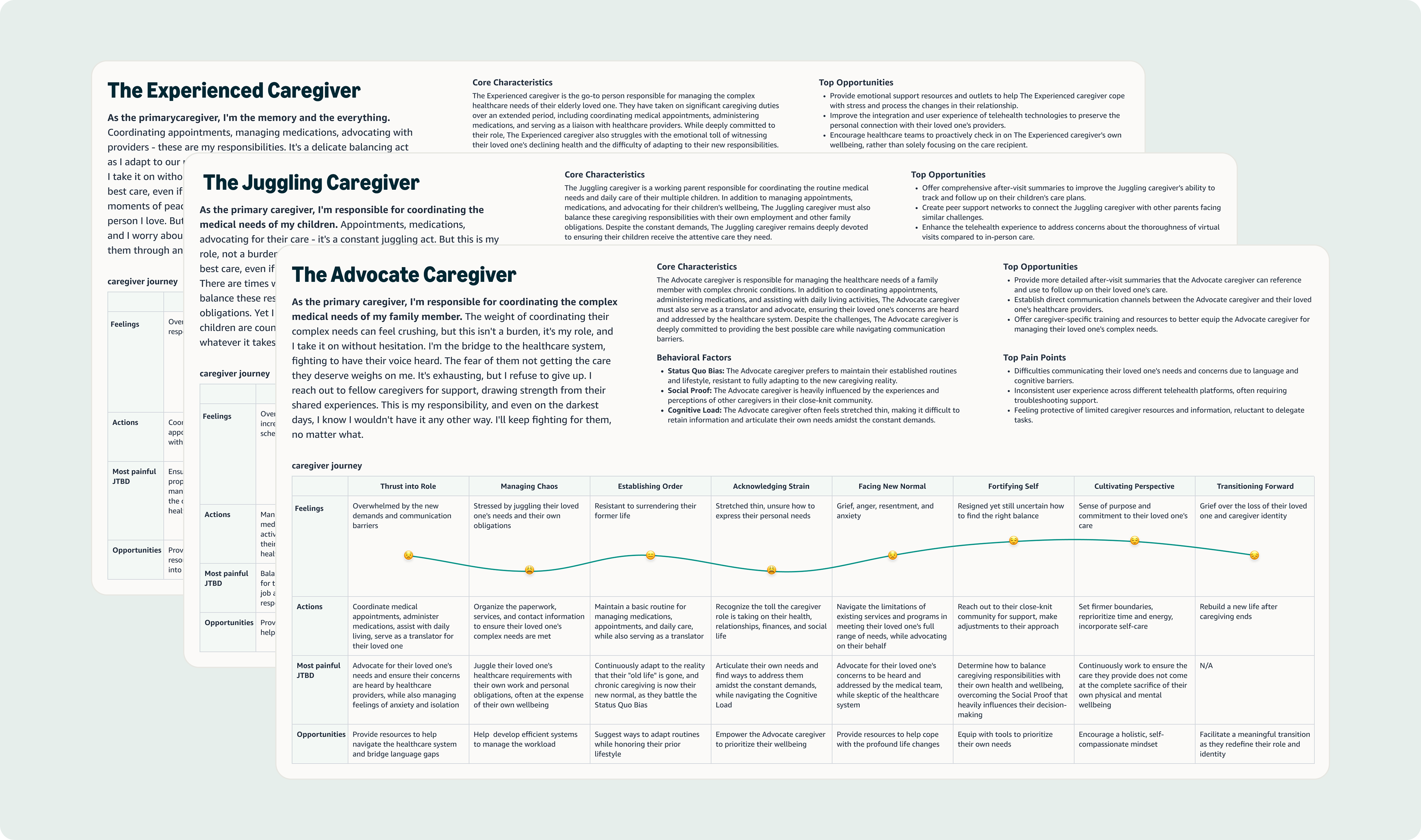
Caregiver Personas & Journey Mapping
Building on past generative research, I developed three distinct personas and journey maps that emerged from the data: The Experienced Caregiver (primary coordinator managing long-term care), The Juggling Caregiver (balancing multiple family members' needs), and The Advocate Caregiver (navigating complex healthcare systems). Each experiences an 8-stage journey from "Thrust into Role" to "Cultivating Perspective."
Building on past generative research, I developed three distinct personas and journey maps that emerged from the data: The Experienced Caregiver (primary coordinator managing long-term care), The Juggling Caregiver (balancing multiple family members' needs), and The Advocate Caregiver (navigating complex healthcare systems). Each experiences an 8-stage journey from "Thrust into Role" to "Cultivating Perspective."
Key Insight: "Caregiver" as a clinical identity excludes most people who actually help with health. The opportunity: design for how people actually live, not how healthcare systems categorize them.

Strategic Leadership: Three Battles That Defined the Platform
Presenting to 1 SVP, 3 VPs, and 2 Directors across Amazon Health Services, Amazon Pharmacy, and Amazon Identity Services, I fought for three strategic decisions that would define the platform.
Inclusive Language Over Clinical Terms
Leadership wanted "caregiver" and "care receiver" language. I pushed back for weeks, armed with evidence:
• Language analysis of 50 apps showing industry shift
• Relationships landscape proving diverse household structures
• Personas showing people don't claim "caregiver" as identity
• Relationships landscape proving diverse household structures
• Personas showing people don't claim "caregiver" as identity
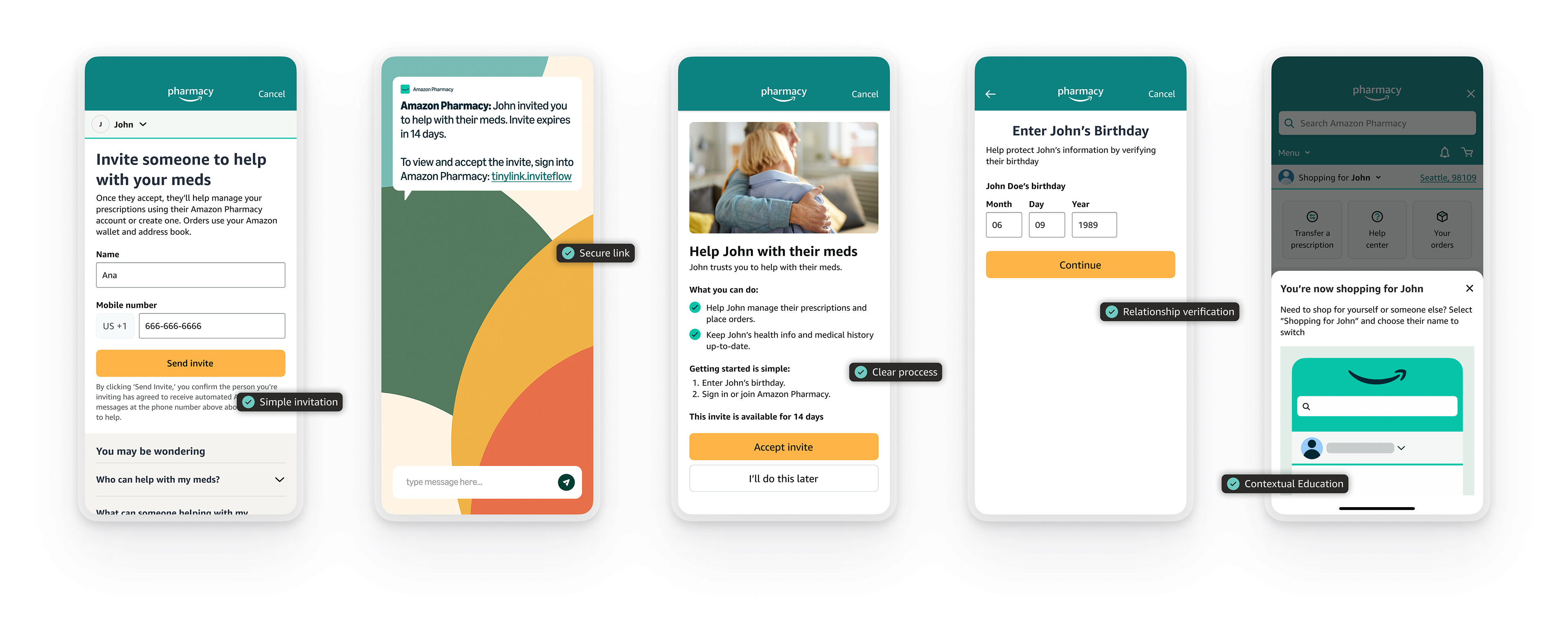
Instead of turning friends and family into "caregivers" and "patients," we focused on natural, everyday actions, like helping your mom manage her prescriptions or tracking your partner's appointments. Instead of "Add a caregiver" and "Managing patient: Ana" we wrote "Invite someone to help" "Shopping for Ana"
The strategic insight: Making it easy to ask for help (not just give it) unlocked a different acquisition model. 42% of care receivers were new to Amazon Pharmacy when they reached out, nearly double the rate of new caregivers (28%). People felt comfortable asking, not just helping. The 8.4% mutual relationships (spouses helping each other) validated we'd expanded beyond traditional caregiving entirely.
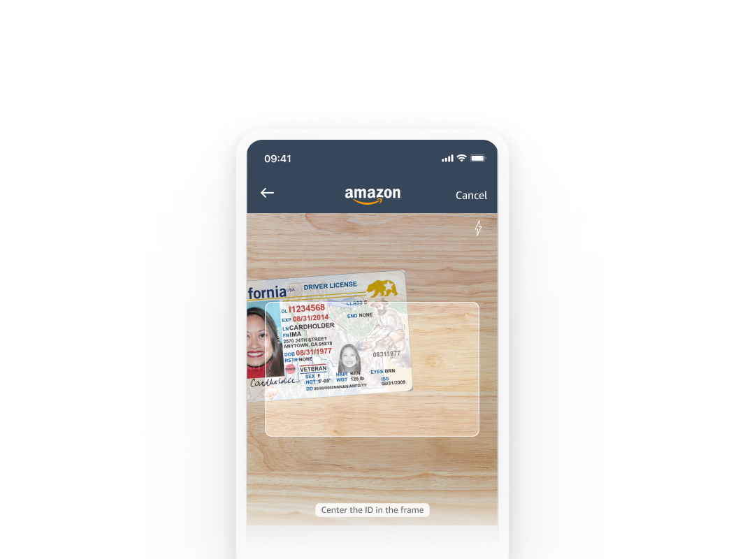
Simple vs extensive verification and enrollment
Security wanted extensive verification (legal name + MFA), Pharmacy VP wanted full enrollment. I advocated for the minimum necessary to meet HIPAA compliance. By persistently questioning what was truly necessary, I worked closely with Legal and Security to identify the minimum requirements: a secure link via text, a matched phone number, and a quick birth date verification.
Security wanted extensive verification (legal name + MFA), Pharmacy VP wanted full enrollment. I advocated for the minimum necessary to meet HIPAA compliance. By persistently questioning what was truly necessary, I worked closely with Legal and Security to identify the minimum requirements: a secure link via text, a matched phone number, and a quick birth date verification.
Instead of Legal name verification and multi-factor authentication, we layered security through the system (invite to number + verified number + birthday)
Instead of full insurance enrollment upfront, I pushed for progressive disclosure (removed insurance from initial flow). We launched with insurance enrollment to maintain velocity. Within weeks, data showed caregivers skipping it. We removed it, no leadership approval needed.
Instead of full insurance enrollment upfront, I pushed for progressive disclosure (removed insurance from initial flow). We launched with insurance enrollment to maintain velocity. Within weeks, data showed caregivers skipping it. We removed it, no leadership approval needed.
The learning: Sometimes you ship to learn. Have your research ready. Persistent questioning of requirements can reveal elegant solutions that satisfy both security and simplicity.
Raising the Bar for Inclusive Design
Amazon Pharmacy had never formally tested for accessibility before launch. As the designer on the project, I championed inclusive design from day one.
By integrating accessibility requirements into every aspect of our work, from initial design through QA, we achieved a significant milestone: Amazon Pharmacy's first accessibility-blockers-free launch. This meant:
• Integrated testing into QA (added days, not weeks)
• Direct developer support on fixes (screen reader navigation, keyboard access, heading levels)
• Established office hours and testing protocols for other designers
• Direct developer support on fixes (screen reader navigation, keyboard access, heading levels)
• Established office hours and testing protocols for other designers
This wasn't just about compliance; it was about creating a truly universal experience that everyone could use, regardless of their abilities. This approach set a new standard for future health projects at Amazon, demonstrating that accessibility isn't an afterthought but a fundamental aspect of excellent user experience design. Now other designers attend my accessibility office hours before development, changing how the organization builds products.
The solution
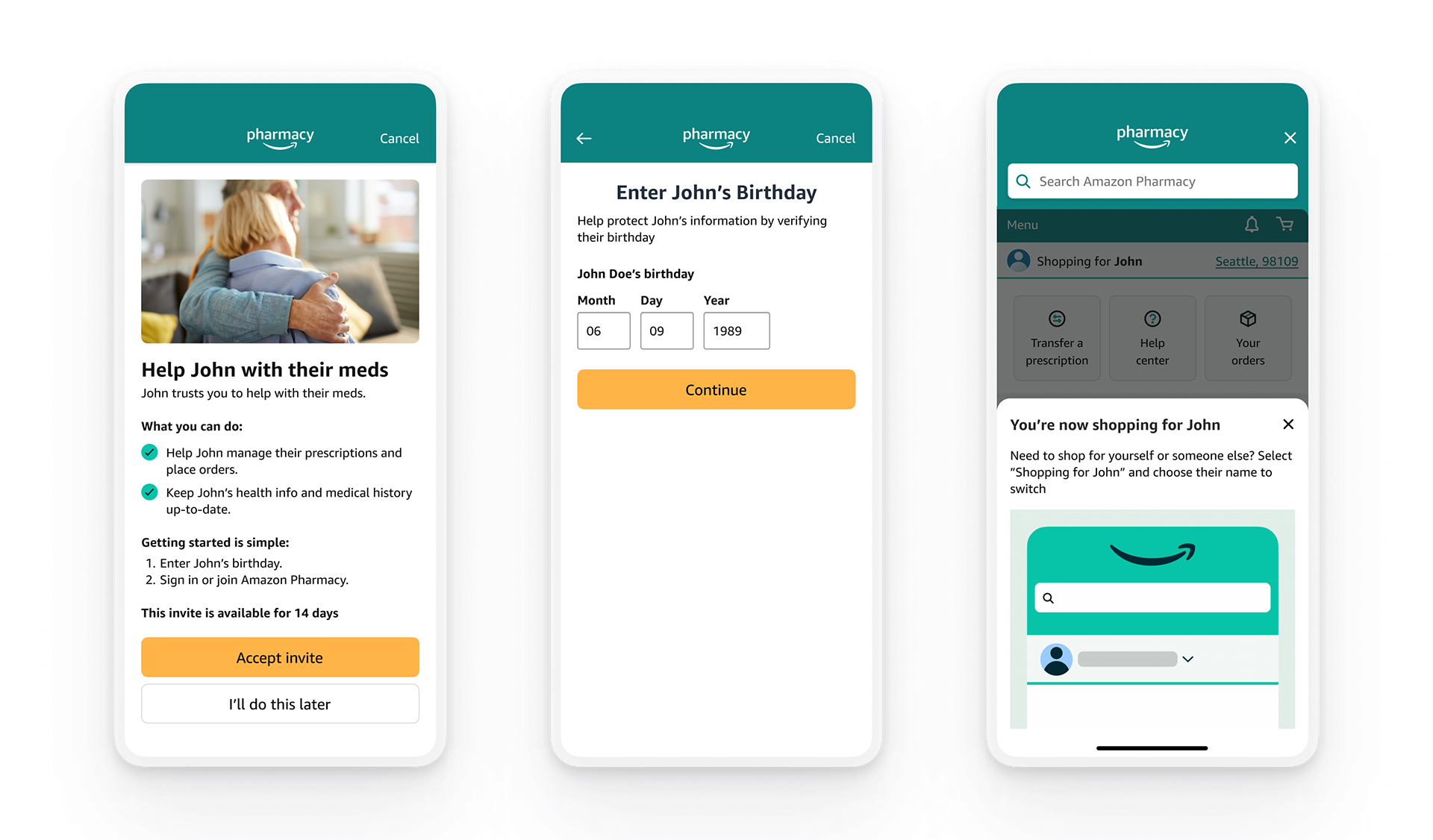
We made helping manage someone's health as natural as sharing a shopping list. With just a name and phone number, customers can invite up to six trusted individuals to help manage their health through Amazon Pharmacy. No clinical terms, no complicated forms - just a simple invitation that extends trust into health management.
Health information is sensitive - you can't just share your password or hand over your account. So we created a system that's as secure as it is simple. A secure link, a matched phone number, a quick verification of a birth date - small steps that build trust while protecting privacy. Once verified, trusted helpers manage prescriptions through their own Amazon accounts, maintaining independence on both sides.
"The simplicity of it is very nice and just the straightforwardness, it's really nice just to be like, I just need a name and phone number and we can get the person authorized to help you... not having to fill out like giant forms to do it. Um, I really like this." - Research Participant
The heart of this system is the Manage Health Access dashboard - a central place where customers can see who they're helping and who's helping them. Here, they can easily add or remove access as needs change. I strategically placed invitation entry points throughout the customer journey - during enrollment, in settings, and on the dashboard - making it natural to ask for help whenever it's needed.
The Experience in Action
Ana logs into Amazon Pharmacy and sees: "Invite someone to help with your meds." She thinks of her son Diego. With just two clicks, Ana enters Diego's mobile number and confirms. The entire process takes less than two minutes. Diego receives an invitation with clear instructions. Once accepted, they can view Ana's medication lists, refill schedules, and place orders. Both can manage medications and schedule deliveries. If Ana ever needs to remove Diego's access, she can do so through her account settings at any time.
Validation Research: Testing the Solution
With the solution built, I conducted usability testing to validate design decisions and identify improvements. 16 participants, 2 studies, CXO framework with industry benchmarks.
Study 1: Care Receiver Experience (n=8)
Discovery gap: Finding "Manage health access" settings took 2min 7sec and 18.75 clicks—far exceeding the 3-7sec industry benchmark for primary navigation.
Discovery gap: Finding "Manage health access" settings took 2min 7sec and 18.75 clicks—far exceeding the 3-7sec industry benchmark for primary navigation.
Permission understanding paradox: Users rated understanding 3/5 but achieved 100% task completion. People learn by doing when helping trusted individuals.
Pre-communication validation: 100% would talk to helpers before inviting (in-person for household, phone for others). Validated our inclusive language approach.
Study 2: Caregiver Experience (n=8)
Insurance enrollment friction: 87.5% questioned why their insurance was needed when just helping someone else. Validated our progressive disclosure decision.
Insurance enrollment friction: 87.5% questioned why their insurance was needed when just helping someone else. Validated our progressive disclosure decision.
Just-in-time education success: Bottom sheet after signup = 100% completion in 30sec (vs 2min 7sec for buried settings). Showed when and how to educate users.
Research-Informed Design Patterns
Dashboard placement Research showed: 2min 7sec, 18.75 clicks to find settings Design decision: Primary entry point reducing navigation to 1 click Result: 77% of traffic by week 24
Dashboard placement Research showed: 2min 7sec, 18.75 clicks to find settings Design decision: Primary entry point reducing navigation to 1 click Result: 77% of traffic by week 24
Just-in-time education Research showed: Permission paradox (3/5 understanding, 100% completion) Design decision: Bottom sheet after signup = 100% completion in 30sec
Progressive disclosure Research showed: 87.5% confused by insurance requirement Design decision: Removed insurance from initial enrollment
Results: Organic Growth, Strategic Scaling
Thousands of relationships established in 4.5 months—hitting targets 40% faster than projected.
70% conversion rate (industry-leading)
42% new customers acquired (care receivers)
30% of helpers actively placing orders
Projected 40% above year-end goals
42% new customers acquired (care receivers)
30% of helpers actively placing orders
Projected 40% above year-end goals
Platform Impact Beyond this Launch
Reusable infrastructure: Permission framework designed for cross-service reuse. Already building on this foundation, with additional services in roadmap.
Accessibility advancement: First blockers-free launch established testing protocols and office hours, now attended by PM's, developers and designers across the organization.
Design patterns adopted: MFA, authentication, and relationship picker components became standard elements ensuring consistent, secure experiences across health programs.
Organizational change: Demonstrated that strategic design thinking can accelerate timelines (40% faster) while raising quality bars (accessibility, security, inclusivity).
What I Learned
Foundational research shapes strategy: The relationships landscape and language analysis gave me the evidence to fight for inclusive language and win.
Pick battles strategically: Insurance enrollment compromise taught me to ship to learn. Data validated research within weeks.
Just-in-time education works: Permission paradox showed people learn by doing when helping trusted individuals.
Inclusive language expands markets: Fighting for natural, everyday action focused language was worth it—8% mutual relationships proved broader reach.
Platform thinking from day one: Designing for cross-service scalability enables expansion to other services on this foundation.